Red Robin Corporate Headquarters
Yummmm!
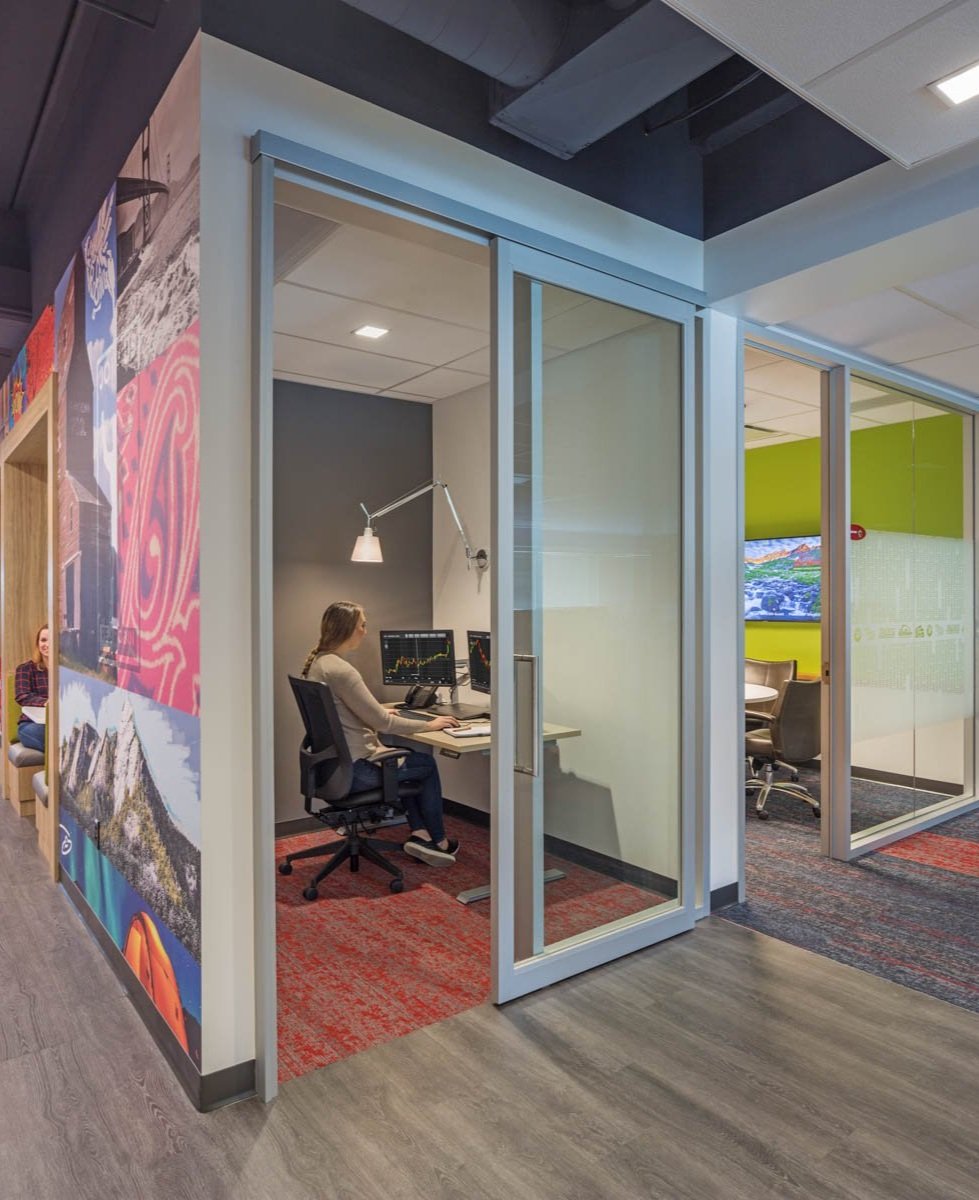
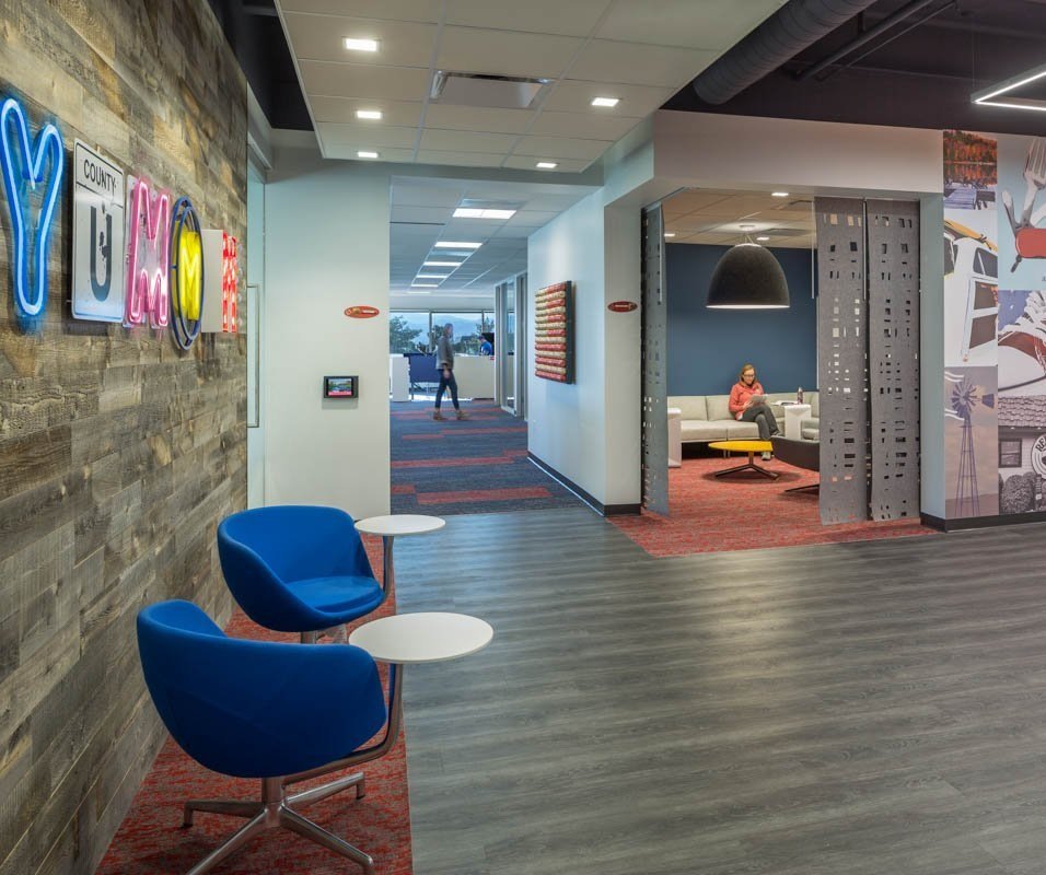
The client, a well-known and beloved food brand, wanted a headquarters that reflected who they are as people: fun, eclectic, and welcoming. They asked for a workspace where people felt welcome to spend their whole day there, just like in their restaurants.
Unification was our main design challenge. We needed to unify an eclectic lighting design which ran the risk of becoming a collage if we strayed too far from the design language and goals. We needed to unify the lighting for the collection of artwork and accent pieces scattered throughout the two-floor office. In fact, we needed to unify the two-floor office, technically separate tenant spaces, to function as one.
To achieve this, we let the brand tell its story with everything we specified. Lighting fixtures were arranged like pieces of art, melding with the eclectic collection of artwork the client included. To add fun we relied on contrasting sizes, from oversized pendants to teeny-tiny fixtures. We also chose bold colors and did not shy away from showier fixture finishes, including shiny glass and sound-dampening felt for huddle spaces, where recipes are treated like state secrets.
The result is a space that speaks the client’s brand language, welcomes people to stay, functions as a collaborative office (without revealing all of its secrets), and at the end of the day is just plain fun.
Client: EUA
Services: Corporate, Lighting Design, Electrical Engineering, Audio Video Design


